Monday, April 8, 2019

Beach Art Center

Last weekend I taught a workshop at the Beach Art Center in Indian Rocks Beach Florida.
It was a small workshop. I titled it "Color Boot Camp".

I think the reason I teach is to learn more about painting and color.  I explore how color works, how color is  expressed,  how to see color.
I start each session with a short demo to put the idea across.


It's important in learning outdoor color to be able to express light key, (sunny morning ) by making a simple study of warms and cool colors coming together.
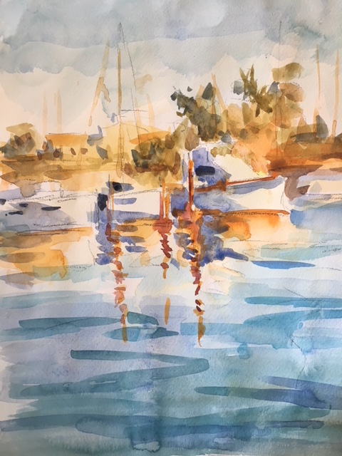
Sky, and Water Demo 

In the afternoon I made another sunny day demonstration. This time expressing a water scene. The two most difficult things to understand is sky and water. They both have atmosphere and light. Painting them blue or green only expresses  local color. It doesn't get specific pertaining to time of day or light key.

Heritage Village 
The second day we had the chance to paint at the Heritage Village, a 21 acre living history museum. The pine and palmetto landscape features some of Pinellas County's most historic buildings. The Village park was a wonderful  place to paint architecture and landscape.

White House in Sunlight

The morning demo was concerning white in the light and white in the shade. Most artist's don't conceder making the white a color other than gray. I tell artist's to make simple studies of blocks in sunlight and try and get the color of white in relation to all the other color blocks. 

In the afternoon I did a demonstration of values and warm and cool colors. Using a split compliment color combination, of Orange, Cobalt Blue and Cadmium yellow deep; I have a limited palette that can express simple warms and cools.


Values Top Split Complements on the bottom

In the second study, the split compliments forced me to make greens rather than depending on green oil paint.


Wednesday, January 31, 2018

Watercolor Sketches

Yesterday, I taught a small watercolor class in Sarasota. I'm not known for watercolors per say however friends and some students have seen some postings of them and asked me to give a lesson.
I learn so much from teaching perhaps that's what I get the most out of the experience of sharing.

I held the class in my friends studio and we primarily focused on the medium of watercolor. I didn't teach it through the lens of color and out door paint as much as I prioritized the procedure of watercolor.

We patiently build up washes from light to dark and plan for and preserve the whites


Thursday, December 14, 2017

Plein Air Painting Trip to Venice

Venice is a place that I have always wanted to paint. I have heard so much about the light and beauty, Venice did not disappoint.
Painting in different settings and typography is extremely challenging to me. Venice has elaborate architecture that must be dealt with. I simplified my painting the way I always do in large masses, then create calligraphy that makes more specific definitions.

I thought about researching all the iconic spots that great painters such as Turner, Sargent, Monet, and Whistler  have painted inVenice ; bringing something of my own to those motifs. When I arrived I was completely overwhelmed and decided that I should take it all in, rather than look for spots to paint.
It takes awhile to acquaint yourself with the light and a specific place as Venice.


Many artist friends had great suggestions as to whether I should bring watercolors (which would be lightweight to carry), or oils. I decided I am more proficient in oils. 
I brought a paint box, tripod, brushes and put my oil paints in a container and packed them in a suitcase. I brought canvas pads and masking tape as well. I through a backpack in the suitcase in the suitcase as well. Finding terpintine and extra paints was no problem I just started asking a local artist and he was kind enough to direct me to a store.

Giovanni Battista Tiepolo


I spent the mornings taking in Venice and seeing some of the museums. I went into a number of churches to see some of the major works Giovanni Battista Tiepolo; who's works I have greatly admired for some time. 
Biennale Arte was quite interesting and took up two mornings to see the whole exhibit; many countries including USA where among the exhibiters.


The afternoons I carried my gear around looking for places to paint. I can be a little distracting with all the visitors Venice commands to find a spot to set up but people more out of the way so I could set up. 

Painting in Venice is an amazing experience due to the ehe ever changing light.  I hope to return another time in the future now that I have had a chance to absorb the light and get a sense of the surroundings and culture.
I painted twelve oil painting plus numerous drawings of Venice.

Friday, July 7, 2017

Split Complements

A split complementary is when you use one of the main colors and two other colors that are adjacent to the complementary color of the chosen hue on the color wheel. The result is a paint scheme that offers high contrast without the tension of a complementary scheme. Examples of split complementary include: (i) red and yellow-green/blue-green or (ii) purple and yellow-orange/yellow-green. There are a total of 12 split complementary paint schemes,that I'm exploring. 
Recently I visited Margret Mcwethy. She encouraged me to make small painting using only the three color groups of split colors.  She felt that  this exercise would enable the artist to see temperature.


The first couple days I painted split complements on a gray day. The one on top I used was Blue (cobalt Blue) Yellow -orange, Red. The bottom one is Blue Green, yellow green  and red.


-This cloudy day study was painted with Blue Yellow Orange, orange red combo.
The example on the top is more of a sunny day compared to the bottom. Top violet Red, Yellow, and Blue. Bottom, Red violet, Viridian, Yellow combo creates the gray day.
These two are interesting study of the complements in a sunny day scheme. Orange, Viridian, Yellow for the top. The bottom was the use of Orange, blue, blue green.
Clearly a sunny day, Yellow, Orange, Blue

Two sunsets Top, Red, Yellow, Blue red combo. Bottom Red, yellow-green , Blue Green.

I found these exercises beneficial in that they stretched my understanding finding cools and warms in all these color combinations. By limiting the color choices I had to make decisions based on temperature instead of color specifics.

Wednesday, May 24, 2017

Art In The Barn

"Anything under the sun is beautiful if only you have vision", is the famous quote Charles W Hawthrone states in the book Hawthonre on Painting.
This past week I had the honor of leading Art  in the Barn, with PAAM. Art in the Barn was a one day event for artist's to paint in the historic barn where Hawthorne taught painting at the turn of the century. Art in the Barn is part of events held in the Hawthorne barn which includes concerts and lectures involving the arts in Provincetown. The month long events are conducted through a non profit organization called Twenty Summers.


More than twenty artist's attended. I set up six simple still life stations and gave a short talk about Charles Hawthorne and the legacy he left to the art world.
The teachings of Hawthorne is about making simple color sports and not being so concerned about the drawing. "Get the color right and you will see how little else you need". Paint the common place in a beautiful way.

Painting in the barn is a unique situation utilizing the great light that pours through the studio. One light source is created through the main large window, creating strong dramatic effects. 


While the Artist's took a break for lunch I set up a model in the north light. I gave a brief demonstration before setting everyone up to paint around the model.

It was an inspiring event that reminded us of the fundament thing that Charles Webster Hawthorn instilled in his students making Provincetown truly a world class Art colony.


Wednesday, April 19, 2017

A Personal View of Watercolor

Last summer I started to use watercolor again. It is a medium that I never really considered until a couple years ago.
 The watercolor must be planned, unlike oils there isn't  a lot of forgiveness. One splash too many and the game is over.
Personally I love the fresh splashy look of watercolor. I find it a constant challenge. The handling of water consistency and the transparency of the medium is what draws me to watercolor.
The Moors watercolor 10x11
The paper has a lot to do with the feeling of the painting. Some watercolor papers are rough and some are smooth. I have explored many different types and like them all.
Watercolor has many techniques involved. Water washes create transparent light washes. If you want more saturated or darker washes you need to have plenty of pigment in your brew!
The End of Winter onCommercial street.
Organizing your big lights and darks is a must along withs handling of the middle notes .
There is a spontaneity and freshness that watercolor gives. However understanding the essentials of watercolor techniques is key.

Chicky Lou
Personally I enjoy renewing my journey with this medium it helps me think about painting in a new way.
Easter Sunday 

copy of farmer

Friday, December 30, 2016

The Impressionist Still Life with John Ebersberger

On the way south I was fortunate to take John Ebersberger's Impressionist  workshop at Maryland Hall in Annapolis.
There where a number of still life table step up for which to choose from.  

The class started with John going over the color wheel with aquatinting us with primary and secondary colors. The first thing we did was to organize our palette using a couple of few of each blues, reds and yellows. 
John maintains that in order to be an impressionist painter you need a variety of colors; we did not use earth tones. At least not until the artist has more experience with color. Otherwise you end up with the "Brown Gravy School" of painting.

From the three primary color we moved on to the secondary colors Orange Purple and Green. John demonstrated that indeed you can make these colors by mixing two primary colors however they aren't pure enough for a full color palette. Once we mixed these colors together we began to make interesting color by mixing colors across from each other and then adding white.
Here are some of the primary colors mixed with  another.  One purple is pure and One Orange is Pure.

Ebersberger then did a demonstration of a still life setup explaining how to interpret the color you see. 
Starting with the color of the jug, John put down a sort of dull orange color and then began to relate the other colors to the orangish vase. Keeping the painting structurally simple is key. By isolating the particular color and comparing it to all other colors keeps the color note legible. Start with a brilliant color and end with the color. 

John pointed out adjusting some colors by mixing across the color wheel brings specific color notes to the painting.

We then started studying our own still life setup. Under John's instruction I gained a new understanding of keeping color notes more legible.
I'm not sure I am willing to abandon all more free falling color expressions, however I am certainly going to be less cavalier with my color choice. 


I find it a rewarding experience taking time out to study with a knowledgable teacher; and it's always fun to be in a class meetingt new people.