Monday, December 31, 2012

The Screen Print

In order to keep my eye fresh, I like to work with different mediums. The Screen Print is a fun way for me to problem solve and get simplistic in my work. I make either a drawing or an oil sketch to work from. The Screen Print is also known as silkscreen, serigraphy,  and serigraph printing.
I love the silkscreen because you don't need a press, and the play of colors you get from this type of printmaking.
I do a little preliminary work before I begin making the print. Pastels of crayons works best for setting up the image with as few colors as possible. I used four colors in this pastel sketch, white is created by the paper, this make five colors. Now I only need four screens to make the color shapes.
Four Values of Black and White
There are several methods to silkscreen. The method I prefer is a more painterly approach. I usually block out where I want the color to be, then I go over it with screen filler, this creates the screen but is not the most precise method. Most graphic designers use a photographic method.
You can read more about these methods from "@"speedball instructions booklet".
I make the first screen color a warm color let it dry then use the same screen to pull a blue over it.

Here is one of the prints, I make several trying different colors to express the image the way I want.

Using the four screens you can make five colors and blocking out for example the bottom part of the screen above, it's possible to  make six colors.


Printmaking in general is a great way to learn about the simple "Notan" design that is essential to good painting.
Notan is the Japanese design concept involving the play and placement of light and dark as they are placed next to the other in art and imagery.


Here is a copy of an Arthur Westley Dow design I used to make a Tee Shirt.
One Screen was used for this print.


I make a few more pulls from my  screens before my final pull to see how I want my colors to work in the design. It's important to work from the lighter colors to the darker colors in this method.

In my final pull I used the four screens to make six colors by using two of my screens twice to create the six colors.
Now I can use my screens to make as many prints as I want.




Wednesday, December 5, 2012

Kitchen Art


I love the work of Wayne Thiebaud, it's simple and painterly.
I am inspired by Thiebaud, and  want to try painting in a real simple direct way. It gets me in my studio.  when I'm stuck trying something where you make up the color and paint one or two items gets me creative again.
I bring these paintings home and put them in my kitchen.

I set my painting up under a light to paint the drama of the simple object. I used my salt and pepper shaker as a subject. I paint on wide canvas that way I don't need to frame the painting it looks modern as well, which is my decor.


Monday, December 3, 2012

Dean Keller, Artist, Teacher

Figure Study, Cairo, 1995 charcoal/paper
by Dean Keller
John Clayton's early drawing
I stumbled upon this drawing I did one winter studying drawing in New York  with Deane Keller.
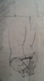
 Deane taught a lot of talented artist's. I thought I would share his interesting small sketch Deane did on the side of my drawing to help me understand the center line.
 I also remember Mr Keller teaching proportions which can be seen on the other side of the drawing.

I get so focused on the landscape, I forget to develop the figure
It's so great to find this gem and perhaps spend some time drawing the figure as well.
Dean Keller felt that most art schools where too cavalier in there approach to training artist's how to draw.
I copied and pasted from Wikipedia a short bio on Deane Keller


 Deane Galloway Keller (August 1, 1940 – January 4, 2005) was an American artistacademic and author.[1] Keller was a draftsmanpaintersculptor, and teacher who instructed students in the visual arts for forty years, most notably in figure drawing and the artistic application of human anatomy