Wednesday, May 30, 2012

The Light Key of Nature

Captain Jack's Wharf is another one of those iconic ptown spots to paint. This painting was done in my class yesterday to demonstrate the cloudy bright light key. I start by painting a few simple color spots then I relate everything to those few basic color notes and then the fun begins.

By keeping things related to the light key produces the color harmony.

The sun came out so I painted another small demo for the class of Cottage street. Here you can see clearly that the light key is different in that it reads as sunlight. This painting goes a step further than just light and shade, because we are dealing with atmospheric changes, and not just strong sunlight. It's a challenge to see and try and paint the different light keys. It's not impossible that's what I tell myself! It's great fun taking the color journey.

Sunday, May 27, 2012

Mechanic Street

I painted today on Mechanic street. It has the famous   red house which is home to Sal's restaurant. This is very iconic Provincetown motif.
I dont' mind going back to a painting I have painted before as long as I discover something new or paint it in a way I haven't painted before.
This painting is painted with brushes as apposed to the knife.


Saturday, May 26, 2012

High Head

Painting at High Head is one of my favorite places to paint. I used big brushes to paint this scene.
I painted it on canvas and it's 20x30 which I find challenging to paint that big on site. You have to watch out for the "gypsy moth" it can be very uncomfortable when they spray you. It's like a burn and poison ivy all at once. Welcome to plein air painting. To me that's really getting out in the elements.

Saturday, May 19, 2012

Morning Rhododendron

I love to  paint the Rhododendron, in bloom on the corner house on Teamont street in Provincetown in the spring. It goes by so fast so I keep the size to an 8x10 so I can paint it in one setting.

Friday, May 18, 2012

Self-Portrait

If you're at a  loss for what to do next do a self-portrait.
This advice is part of the Survival Kit list of Irwin Greenberg.
My self portrait doesn't especially look like me nor is it very flattering. Trying to get an exact likeness can be a stumbling block not to mention missing the point of setting up a lesson in self discipline, or getting to work when you are at a loss of what to paint.

I first made drawings of the plans of the head and some features. You can see the drawings under the canvas paper.
These drawing help to just think about the geometry involved in painting the head. Then I separated the front of the head to the side of the head to give it a block like construction.
George Bridgman's book shows some of these concepts.
Before you know it an hour has passed and you have been painting. So thanks Greenie for that great advice!

Friday, May 11, 2012

North Light Still Life

I took advantage of the rain for three days this past week by painting a more studied still life.
After teaching last week it made me understand the importance of developing your eye for color, by studying still life.
I reread the Henry Hensche book "the Art of Seeing and Painting". In the book henry talks about stating the masses clearly and uniquely in relationship to one another.

One of the challenges I find is  studying the edges. They must be studied as well. I have for years thought just pushing the color together was the right way to handle edges. It's amazing how many bad habits I have taken on over the years. Taking the time to really slow down and study still life in a controlled environment like the studio is a tremendous opportunity for self development.

One the student's in last weeks workshop Dave, brought in a copy of Henry Hensche Color study.   .pdf.http://blueridgeartist.com/media/pdfs/Henry_Hensche_Colour_Study.pdf
If you are interested in reading more about this way of study,  I think this Pdf written by George T.Thermond is one of the best understandings of Hensche's teachings. The book is clearly not a formulaic book made for profit, therefore  it's definitely not for the faint of heart, "reader beware".

Barbara  Torrey
I added this example of one of the student's taking the class last week. I think this is a  good example of a beginning student's raw yet colorful approach.

Saturday, May 5, 2012

May Workshop

Block Study Demo
This week I had my first workshop of the summer. It was a great chance to reacquaint  my self with the fundamentals of light and shade and color.

I gave a quick demo using one color for each side of the block, or mass. Then I mixed another color into the mass refining the color. By painting this way, we are learning to see color so that when we go out to paint a landscape, it will feel like the type of day we painted it, sunny or cloudy.


The students struggled though this exercise and came out with a good feeling of what the sunny day block study should be.
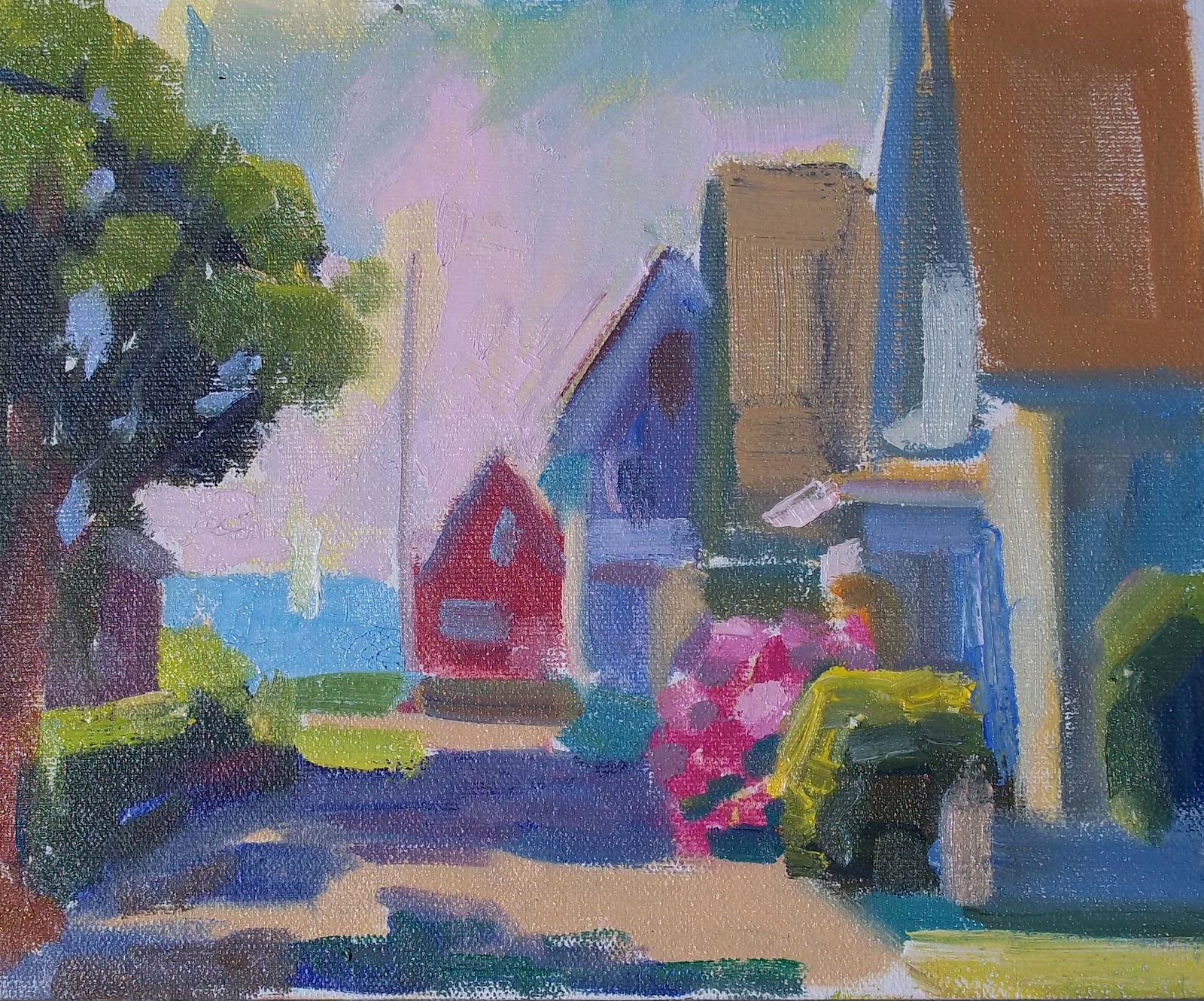
Block Studies 

 In the afternoon I have a quick demonstration of my house and the lane, using a pallet knife. By making one note of color next to the other note of color I created this little study of a landscape created purely through color notes.


I was amazed at the students interest and desire to learn color. It really renewed my own person pursuit of color and made me want to study even more.

We went out and painted a cloudy day landscape of the Moors. it was interesting to see how everyone's painting looked very much like the cloudy day we were having. I think in some ways the local color is easier to see.

When the rain came we went inside and worked on more complicated still life advancing our study of color and developing our eye.

We put up all the paintings from the week up to look at. It was interesting to see how everyone's hard work paid off!
We all got better.
I am more convinced than ever that studying the color is one of the most important aspects of oil painting .